Table of Contents
ToggleAnalogous color schemes don’t just look good on paper, they create rooms that feel pulled together without shouting for attention. By working with colors that sit side-by-side on the color wheel (think blue, blue-green, and green), homeowners can achieve a cohesive look that’s forgiving to live with and surprisingly flexible. Unlike high-contrast schemes that demand precision, analogous palettes let you layer paint, textiles, and finishes without constant second-guessing. This guide walks through the mechanics of analogous design, how to pick and apply palettes that work in real homes, and where beginners trip up.
Key Takeaways
- Analogous interior design uses three adjacent colors from the color wheel to create harmonious, low-contrast rooms that reduce visual fatigue and feel naturally cohesive.
- Follow the 60-30-10 ratio for room color distribution: dominant color covers 60–70% of space, secondary color 20–30%, and accent color 10% to prevent overwhelming the design.
- Vary saturation and value among your chosen colors—mixing navy, sky blue, and pale aqua prevents analogous schemes from looking flat and monotonous.
- Analogous palettes work exceptionally well with existing fixed elements like flooring and built-ins; assess warm or cool undertones in these pieces before selecting your palette.
- Test paint samples for 2–3 days under both natural and artificial lighting at different times of day, since color perception shifts dramatically between morning, evening, and various light sources.
- Layer textiles and finishes after painting, incorporating 20–30% neutral elements (white, gray, natural wood tones) to provide visual rest and prevent analogous rooms from feeling claustrophobic.
What Is Analogous Interior Design?
Analogous interior design uses colors that sit next to each other on the color wheel, typically three hues in a row. Common examples include blue, blue-violet, and violet, or yellow, yellow-orange, and orange. Because these colors share a base hue, they blend naturally without clashing.
This approach differs from complementary schemes (opposite colors) or triadic schemes (evenly spaced around the wheel). Analogous palettes create low contrast and high harmony, making them ideal for spaces where you want visual flow rather than drama. Analogous colors work by limiting the range of wavelengths your eye processes, which reduces visual fatigue.
In practice, you’ll choose one dominant color (usually covering 60–70% of the room), a secondary color (20–30%), and an accent color (10%). This ratio prevents any single hue from overwhelming the space. The dominant color typically goes on walls or large furniture pieces, the secondary on upholstery or window treatments, and the accent on pillows, artwork, or small decor items.
One key advantage: analogous schemes are forgiving for DIYers. If your paint swatches don’t match perfectly under different lighting, the inherent harmony keeps the room from looking disjointed. That said, these palettes can feel flat if you don’t vary saturation and value (lightness/darkness). A room painted entirely in medium-toned blues will read as monotonous: mixing navy, sky blue, and pale aqua creates depth.
Why Analogous Color Schemes Work So Well in Interior Spaces
Analogous palettes succeed because they mimic color relationships found in nature, sunsets (orange, red, pink), forests (yellow-green, green, blue-green), and coastlines (blue, teal, green). Our brains are wired to find these transitions soothing.
From a practical standpoint, analogous schemes simplify decision-making. When selecting throw pillows, rugs, or artwork, you’re working within a narrow band of the spectrum. This constraint actually speeds up shopping and reduces the risk of impulse buys that don’t fit. Many homeowners report that design decisions become less overwhelming once they commit to an analogous framework.
These palettes also handle varied finishes gracefully. A room with matte sage walls, glossy teal trim, and brushed-nickel fixtures in blue-gray tones will still read as cohesive because the underlying hues align. This is harder to pull off with complementary schemes, where sheen differences can amplify contrast to jarring levels.
Another benefit: analogous schemes age well. Trendy accent colors (think millennial pink or Gen Z yellow) come and go, but a blue-green-teal palette rooted in classic color theory won’t look dated in five years. You can refresh the space by swapping out the accent color, say, moving from coral accents to gold, without repainting entire rooms.
That said, analogous palettes aren’t foolproof. Rooms with poor natural light can look muddy if you choose three mid-tone colors. In north-facing rooms or basements, opt for at least one light-value color (paint with an LRV above 60) to reflect available light. South-facing rooms can handle deeper, saturated palettes without feeling cave-like.
How to Choose the Perfect Analogous Color Palette for Your Home
Start by assessing your existing fixed elements, flooring, countertops, tile, and any built-ins you’re not replacing. Honey oak floors lean warm (yellow-orange undertones), so an analogous palette of red-orange-yellow complements them better than cool blues. Gray luxury vinyl plank with cool undertones pairs naturally with blue-green-teal schemes.
Next, consider the room’s function and light exposure. Cool analogous palettes (blue, blue-green, green) work well in rooms where you want calm, bedrooms, bathrooms, home offices. Warm palettes (yellow, orange, red) energize social spaces like kitchens and dining rooms. East-facing rooms get warm morning light, so cool palettes balance that glow: west-facing rooms benefit from warm palettes that amplify golden afternoon light.
Test paint samples on at least two walls, one that gets direct light and one in shadow. Paint a 2′ × 2′ square and live with it for a few days. Colors shift dramatically between morning and evening, and between natural and artificial light. Use a color wheel app or a physical wheel (available at most paint stores) to confirm your three hues are actually adjacent.
For beginners, starting with pre-curated palettes reduces risk. Many paint brands offer analogous collections, Sherwin-Williams’ “Coastal Cool” (blues and greens) or Benjamin Moore’s “Golden Afternoon” (yellows and oranges). These eliminate the guesswork around undertones, which is where most DIYers struggle. A “blue” can lean purple, green, or gray depending on its pigment mix, and clashing undertones kill the harmony analogous schemes promise.
If you’re working with existing furniture or area rugs, pull your palette from the piece with the most visual weight. A large sectional sofa or an heirloom rug should anchor your color choices. Use painter’s tape to mask off sections of the item, isolating individual colors, then match paint chips to those sections. This ensures your walls support rather than fight your furnishings.
Popular Analogous Color Combinations for Every Room
Certain analogous palettes have proven track records across different home styles and climates. Here’s how to deploy them effectively.
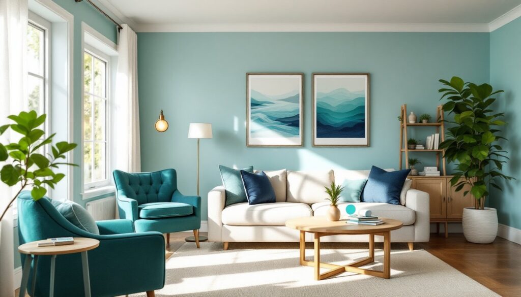
Blue-Green-Teal Schemes for Calming Spaces
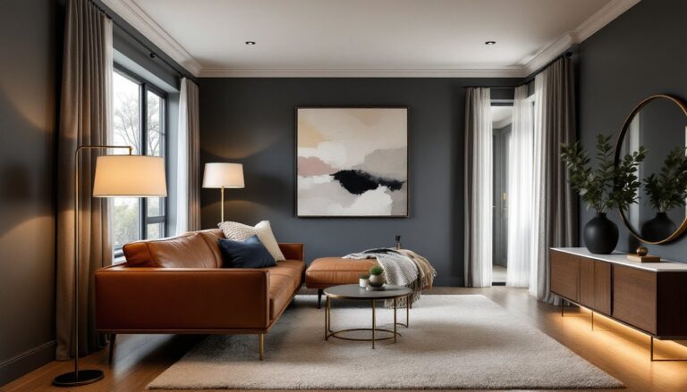
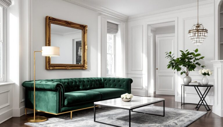
Blue-green-teal is the most popular analogous palette in residential design, especially in bedrooms and bathrooms. This combination reads as spa-like without feeling clinical. In practice, that might mean walls in a soft aqua (Benjamin Moore “Spring Sky”), trim in a deeper teal (Sherwin-Williams “Tidewater”), and accents in navy or turquoise.
This palette pairs naturally with white or light wood finishes, think maple or birch. It also complements brushed nickel, chrome, or matte black fixtures. For textiles, linen and cotton in natural tones (cream, oatmeal, soft gray) keep the space from feeling too themed. Many interior design approaches recommend limiting patterns in cool analogous schemes: the colors themselves create enough interest.
One common mistake: using all cool-toned blues and greens in a room with fluorescent or LED lighting above 4000K (cool white). The space will feel sterile. Swap in warmer LED bulbs (2700–3000K) to add visual warmth without changing your paint. If your room lacks natural light, incorporate wood tones or warm metallics (brass, copper) to prevent a cold, underwater vibe.
This palette works across design styles, coastal, modern Scandinavian, mid-century, even traditional when paired with darker wood furniture.
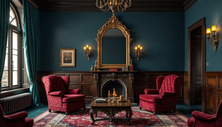
Yellow-Orange-Red Palettes for Energizing Rooms
Yellow-orange-red schemes bring energy and warmth, making them ideal for kitchens, dining rooms, and living spaces in cooler climates. A typical execution: walls in a soft butter yellow, cabinetry or an accent wall in terracotta or burnt orange, and accessories in deep red or rust.
These palettes demand careful saturation management. All three colors at full intensity will overwhelm a room. Instead, use one color at high saturation (the accent), one at medium (the secondary), and one at low saturation or high value (the dominant). For example, a pale primrose yellow on walls, a muted clay orange on built-in shelving, and burgundy throw pillows.
Warm analogous schemes pair well with natural materials, exposed brick, terracotta tile, oak or walnut flooring, leather upholstery. They also play nicely with oil-rubbed bronze or antique brass hardware. Avoid cool-toned metals (chrome, stainless steel) unless you’re deliberately creating contrast: they’ll feel out of place.
Lighting matters here, too. Warm analogous palettes can look muddy under cool LED bulbs. Stick with 2700K bulbs or consider Edison-style filament bulbs for fixtures where you want visible warmth. According to design experts at MyDomaine, layering light sources, ambient (overhead), task (under-cabinet), and accent (picture lights), prevents warm palettes from feeling flat.
This palette skews traditional or rustic, but it also works in eclectic or bohemian spaces where layering patterns and textures is part of the aesthetic. Just keep the color ratios disciplined: the 60-30-10 rule is especially important with warm schemes, which can tip into visual chaos if all three colors compete for dominance.
Step-by-Step: Implementing Analogous Design in Your Space
Once you’ve chosen your palette, execution follows a sequence that minimizes mistakes and rework.
Step 1: Prep and prime walls. Clean walls with TSP (trisodium phosphate) or a degreaser, especially in kitchens. Fill nail holes with spackling compound, sand smooth with 120-grit paper, then prime. Use a tinted primer matched to your dominant color: it reduces the number of finish coats needed and ensures even coverage. Standard primer coverage is about 400 sq ft per gallon, but textured walls may require more.
Step 2: Paint in order of permanence. Start with walls (dominant color), then trim and doors (secondary color), then any accent walls or built-ins (accent color). Use painter’s tape rated for delicate surfaces if you’re taping over freshly dried paint: standard blue tape can pull up latex paint that hasn’t fully cured (which takes 30 days, even though it’s dry to the touch in hours). Cut in edges with a 2.5″ angled brush, then roll with a 3/8″ or 1/2″ nap roller for smooth walls. Apply two coats minimum, waiting 4 hours between coats in low humidity.
Step 3: Layer in textiles and finishes. Once paint is dry, bring in larger textile pieces, curtains, area rugs, upholstered furniture. Distribute your three colors unevenly: remember the 60-30-10 ratio. If your walls are the dominant color, your sofa or rug should pull from the secondary color, and pillows, throws, or artwork introduce the accent. Avoid buying all-new furniture: home decor strategies often involve reupholstering one statement piece or slipcovering a sofa to match your new palette.
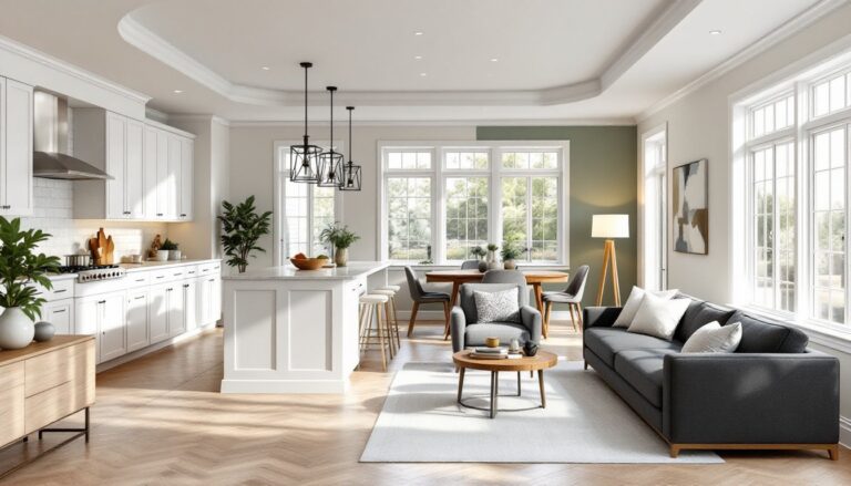
Step 4: Adjust saturation and value for depth. This is where analogous schemes either succeed or fall flat. Add neutrals, white, black, gray, beige, or wood tones, to break up the color and provide visual rest. A room that’s 100% color will feel claustrophobic. Aim for 20–30% neutral elements. That might mean white trim, a natural-fiber rug, or black metal light fixtures.
Step 5: Test lighting before finishing touches. Turn on all light sources at different times of day. If colors look washed out or muddy, adjust your bulb color temperature or add dimmers to control intensity. Recessed LED retrofits (available at home centers) let you swap color temps without replacing fixtures. For spaces where you’re using design tools, verify that your digital renderings match real-world lighting conditions: screens display colors in RGB, which don’t always translate accurately to physical paint (which uses pigments).
Safety note: When painting, especially with oil-based primers or paints, ensure adequate ventilation. Open windows, use box fans to exhaust fumes, and wear an N95 or VOC-rated respirator if you’re sensitive to solvents. Latex paints are low-VOC but still release fumes during application and drying.
Finally, step back and live with it for a week before adding final accessories. Analogous schemes reveal themselves over time, especially as natural light shifts with the seasons. What looks perfect in April might feel too cool in November. Keep paint codes and fabric swatches in a binder so you can make adjustments down the road without starting from scratch.