Table of Contents
ToggleMost people instinctively arrange furniture in matching pairs, two nightstands flanking a bed, identical lamps on either end of a sofa. It’s safe, predictable, and often boring. Asymmetrical balance flips that script, creating rooms that feel intentional and alive without the rigid formality of mirror-image layouts. Instead of relying on identical objects placed at equal distances, asymmetrical design uses varying elements, different sizes, colors, textures, or visual weights, to achieve equilibrium. The result? Spaces that guide the eye, invite exploration, and feel curated rather than catalog-ordered.
Key Takeaways
- Asymmetrical balance in interior design distributes visual weight unevenly to create engaging, intentional spaces that feel more dynamic and personal than rigid symmetrical layouts.
- Master visual weight by considering size, color, texture, complexity, and placement—a small dark chair can balance a large light sofa because darker colors carry more visual weight.
- Start applying asymmetrical balance in living rooms by anchoring one side with a substantial piece and balancing it with a different configuration opposite, such as pairing a sofa with art and a sculptural object.
- Avoid common mistakes like confusing asymmetry with randomness, overloading one side, or forgetting scale—every element should be deliberately placed for intentional visual equilibrium.
- Bedrooms and dining rooms benefit greatly from asymmetry, trading matching furniture for character-filled arrangements like varied nightstands or mixed chair styles that reflect how people actually live.
- Use the ‘step back and squint’ test to assess overall balance; take photos to spot imbalance more easily, and remember that asymmetry often requires more negative space than symmetry.
What Is Asymmetrical Balance in Interior Design?
Asymmetrical balance is a design principle where visual weight is distributed unevenly across a space, yet the overall composition still feels balanced. Think of a seesaw: symmetry is two equal weights at equal distances from the fulcrum. Asymmetry is a heavier weight closer to the center balanced by a lighter weight farther out.
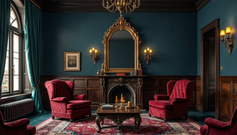
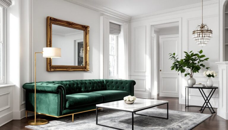
In practical terms, this might mean pairing a large, dark armchair on one side of a fireplace with two smaller, lighter accent chairs on the other. Or hanging a single oversized piece of art on one wall and balancing it with a gallery wall of smaller frames opposite. The eye registers the arrangement as stable, but there’s movement and interest that symmetry can’t deliver.
This approach draws from principles rooted in visual arts and architecture, where designers have long understood that perfect symmetry can feel static. Asymmetry introduces tension and resolution, your brain works a bit harder to “read” the room, which makes the space more engaging. It’s a cornerstone of many interior design styles, from mid-century modern to eclectic bohemian.
Why Asymmetrical Balance Works Better Than Symmetry
Symmetry has its place, formal dining rooms, traditional entryways, hotel lobbies, but in most residential spaces, it can feel stiff or sterile. Asymmetrical balance offers flexibility, personality, and a sense of movement that mirrors how people actually live.
First, it accommodates real-world constraints. Not every room has matching architectural features or enough square footage for identical furniture groupings. Asymmetry lets you work with what you have: an off-center window, an awkward alcove, or mismatched vintage finds.
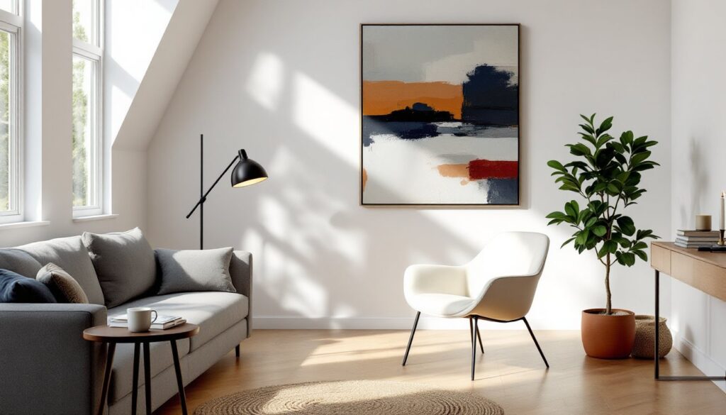
Second, it creates focal points and visual flow. When every element is mirrored, the eye has nowhere to land, it’s all equally important, which paradoxically makes nothing stand out. Asymmetry directs attention. A bold sculptural floor lamp on one side of a sofa draws the eye, while smaller elements on the other side provide balance without competing.
Third, asymmetrical arrangements feel more human. Homes accumulate objects over time: a painting from a trip, a chair inherited from family, a plant that outgrew its original pot. Asymmetry celebrates that organic growth rather than forcing everything into rigid pairs. It’s honest design that reflects how spaces evolve.
Key Principles for Achieving Asymmetrical Balance
Asymmetry isn’t random. It requires a more nuanced understanding of composition than symmetry does. The goal is controlled imbalance, elements that feel deliberately placed, not accidentally mismatched.
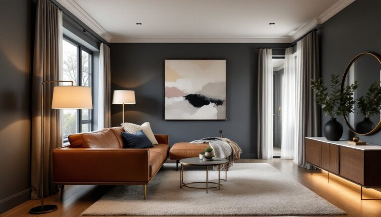
Scale and proportion matter. A sectional sofa anchoring one side of a living room can be balanced by a console table and large piece of art on the opposite wall. The sofa is physically bigger, but the visual weight of the art and table combined creates equilibrium.
Color intensity also affects balance. Darker or more saturated colors carry more visual weight than light or neutral tones. A small black accent chair can balance a much larger pale linen sofa because the dark color pulls the eye.
Texture and pattern add another layer. A smooth, minimal surface feels lighter than a heavily textured or patterned one of the same size. A plain white wall might need a large piece of art, while a wall with exposed brick or patterned wallpaper can hold its own with less.
Visual Weight and How to Balance It
Visual weight is the perceived “heaviness” of an object based on size, color, texture, complexity, and placement. Mastering it is the key to asymmetrical balance.
Size is the most obvious factor: larger objects feel heavier. But color, shape, and detail can amplify or reduce that weight. A large, simple object (like a white Parsons table) feels lighter than a small, ornate one (like a carved wooden console in dark walnut).
Position in the room also matters. Objects placed higher on a wall or farther from the room’s center feel lighter than those at eye level or near the focal point. A high shelf with a few small objects can balance a low, chunky coffee table across the room.
Groupings affect weight, too. Three small items clustered together carry more visual weight than the same three items spread apart. Use this to your advantage: a collection of small vases on one side of a mantel can balance a single large candlestick on the other.
Test your arrangement by taking a photo. It’s easier to spot imbalance in a two-dimensional image than in person. If one side feels too heavy, try adding a lighter element to the opposite side, adjusting color contrast, or repositioning items.
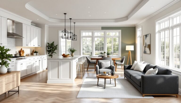
Practical Ways to Use Asymmetrical Balance in Every Room
Living rooms are the easiest place to start. Anchor one side with a substantial piece, a sofa, bookshelf, or media console, and balance it with a different configuration on the other side. Instead of matching end tables, use one tall floor lamp and one lower side table with a stack of books. Hang art off-center above the sofa and balance with a tall plant or sculptural object on the opposite side of the room.
Bedrooms often default to symmetry (matching nightstands, identical lamps), but asymmetry adds character. Try a nightstand on one side and a small chair or ladder shelf on the other. Hang a single large piece of art above the bed instead of a centered grouping, and balance with a floor mirror or tall plant in the corner. This works especially well in smaller bedrooms where matching furniture eats up floor space.
Dining rooms can benefit from asymmetry in lighting and wall decor. Instead of a single centered chandelier, consider a cluster of pendants hung at varying heights off to one side, balanced by a large piece of art or a sideboard on the opposite wall. Mix chair styles, upholstered chairs at the ends, simpler wood chairs along the sides, for a collected, less formal look. Thoughtful choices in Home Decor Interior Design can make even traditional spaces feel fresh.
Entryways and hallways are perfect for asymmetrical vignettes. Place a narrow console table against one wall with a large mirror or art above it, and balance with a coat rack or tall umbrella stand on the opposite side. Vary the heights and shapes, vertical elements on one side, horizontal on the other.
Kitchens can incorporate asymmetry through open shelving. Instead of evenly spaced shelves with identical objects, try different shelf lengths or heights. Balance a heavy grouping of dishes or cookware on one side with lighter, more dispersed items (glassware, small plants, a single piece of pottery) on the other. Even small adjustments to established Interior Home Design principles can shift how a space feels.
Bathrooms are often too small for much asymmetry, but you can apply the principle to mirrors and lighting. Instead of a centered mirror above a vanity, hang it slightly off-center and balance with a wall-mounted sconce or shelf on the opposite side.
Common Mistakes to Avoid When Designing with Asymmetry
Confusing asymmetry with randomness. The difference between intentional asymmetry and a cluttered mess is planning. Every element should have a reason for being where it is. Step back frequently and assess whether the room feels balanced or just chaotic.
Ignoring the room’s architecture. Asymmetry works with existing features, not against them. If you have a centered fireplace or window, you can still use asymmetry in the surrounding decor, but fighting the room’s natural focal points creates visual tension in the wrong way.
Overloading one side. Asymmetry doesn’t mean all the furniture goes on one side and the other side stays empty. You’re redistributing visual weight, not abandoning one half of the room. If one side feels too heavy, the space will feel tilted and uncomfortable, no matter how interesting individual pieces are.
Forgetting scale. A common error is balancing a large, heavy object with too many small ones. Three tiny candles won’t balance a massive armoire. You need enough combined visual weight on the lighter side, whether through size, color, texture, or grouping, to create equilibrium. Exploring options in Home Decor and Interior can offer insight into proper scaling.
Neglecting negative space. Empty wall or floor space is a design element, too. Asymmetry often requires more breathing room than symmetry because the eye needs space to process the composition. Don’t fill every gap just because it’s there. Many design inspiration sources highlight the power of restraint in asymmetrical layouts.
Skipping the “step back and squint” test. This old designer trick helps you see the room’s overall balance rather than individual pieces. Squint until details blur, if one area looks noticeably darker, heavier, or more crowded, adjust accordingly.
Conclusion
Asymmetrical balance isn’t a free-for-all, it’s a disciplined approach to creating rooms that feel dynamic, personal, and alive. It requires a sharper eye than symmetry, but the payoff is space that reflects how people actually live, not how a showroom stages furniture. Start small: move one lamp, rehang one picture, swap one matching piece for something different. Trust your eye, test the weight, and don’t be afraid to break the pairs.