Table of Contents
ToggleBeige has shaken off its “boring” reputation. After years of stark white walls and cold grays dominating the design world, homeowners are rediscovering what beige does best: create warm, livable spaces that don’t scream for attention. It’s not about playing it safe, it’s about building a versatile backdrop that lets texture, natural light, and thoughtful accents do the heavy lifting. Whether someone’s tackling a full room refresh or just tired of their current palette, beige offers a foundation that works with almost any style, from modern farmhouse to minimalist chic.
Key Takeaways
- Beige interior design has made a major comeback by emphasizing warmth and complexity through natural materials like oak trim, linen, and stone, moving beyond outdated builder-grade applications.
- Understanding undertone differences is critical—warm beiges with yellow or peach tones suit north-facing rooms, while cool beiges with gray or blue undertones work better in south-facing spaces with abundant light.
- Layering beige without monotony requires varying light values (light, medium, and dark tones) and finish types (matte, satin, semi-gloss) to create depth and visual interest.
- Pairing beige with earthy tones, deep blues, charcoal, or black accents enhances sophistication, while avoiding cool pastels prevents a dated appearance.
- Texture is essential to successful beige interiors—incorporate natural wood, linen, stone, velvet, or rattan to add dimension and prevent spaces from feeling flat or sterile.
- Each room requires a tailored approach: living rooms benefit from layered tones and black accents, bedrooms thrive with soft warm beiges for relaxation, kitchens need durable finishes, and proper surface prep with quality paint ensures durability.
Why Beige Interior Design Is Making a Major Comeback
Beige fell out of favor around 2010 when Pinterest feeds exploded with all-white everything and industrial grays. But trends cycle, and beige is back with better company. The difference now? People aren’t slapping builder-grade beige paint on every surface and calling it done.
Today’s beige interiors lean into warmth and complexity. Designers and DIYers alike are pairing neutral bases with natural materials, think oak trim, linen upholstery, and stone countertops. The result feels intentional, not default. Beige also photographs beautifully in natural light, which explains its resurgence on social media platforms where home decor inspiration drives renovation decisions.
Another practical reason: beige hides imperfections better than stark white. Scuff marks, uneven drywall texture, and older trim profiles blend into warmer neutrals. For homeowners working with existing finishes or DIY-level skills, that’s a real advantage. It’s forgiving, adaptable, and doesn’t demand perfect execution to look polished.
Understanding the Versatility of Beige Tones
Not all beiges are created equal. Walk into any paint store and the neutral section sprawls across dozens of sample cards, some lean pink, others green, yellow, or gray. The key is understanding undertones, because that’s what makes or breaks a beige scheme.
Test paint samples on at least two walls in the room: one that gets direct sunlight and one that doesn’t. Natural light shifts throughout the day, and what looks like a soft tan at 10 a.m. might read peachy-orange by 4 p.m. Artificial lighting (LED vs. incandescent) changes things further. Always let samples dry for 24 hours before deciding: wet paint looks darker and more saturated.
Warm vs. Cool Beige: Choosing the Right Shade for Your Space
Warm beiges have yellow, peach, or red undertones. They work well in north-facing rooms that get limited direct sun, adding coziness without feeling dim. Pair these with natural wood tones, terracotta accents, and brass or oil-rubbed bronze hardware. Popular warm beige paint colors include Sherwin-Williams Accessible Beige (SW 7036) and Benjamin Moore Revere Pewter (HC-172), though the latter leans slightly greige.
Cool beiges carry gray, green, or blue undertones. These suit south-facing rooms with abundant light, preventing spaces from feeling too warm or yellow. Cool beiges complement white oak, concrete, stainless steel, and matte black fixtures. They bridge the gap between gray and beige, often called “greige”, and offer a more contemporary feel.
If the room has existing finishes (tile, countertops, flooring), bring samples home and compare them side-by-side. Clashing undertones create a muddy, disjointed look that no amount of decor can fix.
How to Layer Beige Without Creating a Flat, Boring Room
A monochrome beige room fails when everything sits at the same value and finish. The fix isn’t adding color, it’s adding depth through contrast and variation.
Start by mapping out light, medium, and dark values. Walls might be a mid-tone beige, trim and ceilings a lighter cream, and furniture or accents a deeper taupe or sand. This creates visual separation without introducing new hues. Many homeowners embrace minimalist design principles by keeping color restrained while varying tone and texture.
Finish variation matters just as much. Pair matte wall paint with satin or semi-gloss trim. Use flat linen curtains against a subtle sheen on painted furniture. Mix a matte ceramic lamp base with a glossy side table. These small shifts in how surfaces reflect light prevent the room from reading as flat or one-dimensional.
Don’t shy away from darker beiges and taupes. A deep mushroom-toned accent wall or upholstered headboard anchors the space and gives the eye somewhere to rest. Without these darker notes, beige rooms can feel washed out, especially under bright overhead lighting.
Best Color Pairings and Accent Colors for Beige Interiors
Beige is the ultimate team player, it doesn’t compete, it supports. That said, not every accent color works equally well.
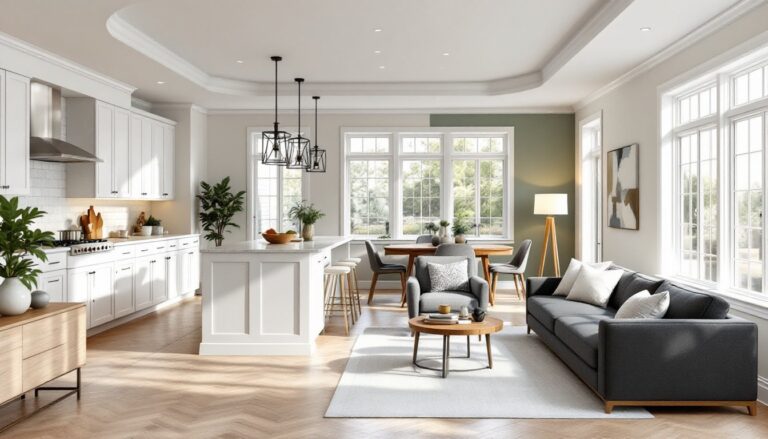
Whites and creams keep things light and airy. Use crisp white trim and cabinetry against warm beige walls for a classic, clean look. This pairing works in kitchens, bathrooms, and cozy living spaces where simplicity is the goal.
Earthy tones (terracotta, rust, olive, clay) enhance beige’s natural warmth. These work especially well in dining rooms, bedrooms, and spaces with wood furniture. Think burnt orange throw pillows, sage green pottery, or a terracotta area rug.
Deep blues and charcoals add sophistication without clashing. Navy, slate blue, and charcoal gray provide contrast while maintaining a grounded, mature palette. This combo suits home offices, libraries, and modern living rooms.
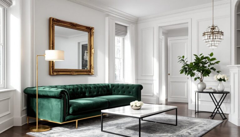
Black accents create instant definition. Matte black cabinet hardware, picture frames, or light fixtures pop against beige without overwhelming the space. It’s a small move with big impact, especially in kitchens and bathrooms where hardware is abundant.
Avoid pairing beige with cool pastels (baby blue, lavender, mint). The temperature clash reads dated and disconnected. Stick to either warm or cool within the same family for a cohesive feel.
Textures and Materials That Elevate Beige Design
Texture is where beige interiors truly shine, or fall flat. A room full of smooth, painted surfaces in the same tone will always feel sterile. Introduce tactile variation and the space comes alive.
Natural wood is non-negotiable. Whether it’s oak flooring, a walnut dining table, or pine shelving, wood grain adds organic pattern and warmth. Stain tones should complement the beige undertone, honey oak with warm beiges, white oak or driftwood with cool beiges. Avoid cherry or mahogany unless leaning into a traditional aesthetic: they can overpower softer neutrals.
Linen and cotton textiles bring softness without fuss. Linen curtains, cotton throw blankets, and upholstered linen dining chairs introduce subtle texture that catches light beautifully. Avoid heavy synthetics or overly shiny fabrics, they cheapen the look.
Stone and concrete add weight and contrast. A honed marble countertop, concrete fireplace surround, or travertine tile backsplash grounds beige interiors with a modern edge. These materials work especially well in kitchens and bathrooms where durability matters. Inspiration for pairing natural materials with neutral palettes can be found in designer home tours that showcase sophisticated use of beige.
Jute, sisal, and rattan connect indoor spaces to the outdoors. A jute area rug, rattan pendant light, or sisal basket adds texture at a lower price point than stone or hardwood. These materials suit casual, laid-back spaces but can feel out of place in formal settings.
Velvet and bouclé introduce luxury. A velvet accent chair in camel or a bouclé sofa in oatmeal elevates the room instantly. These fabrics catch and reflect light in ways flat-weave textiles can’t, adding dimension without busy patterns.
Room-by-Room Beige Design Ideas for Your Home
Beige adapts to every room, but the approach shifts based on function and traffic.
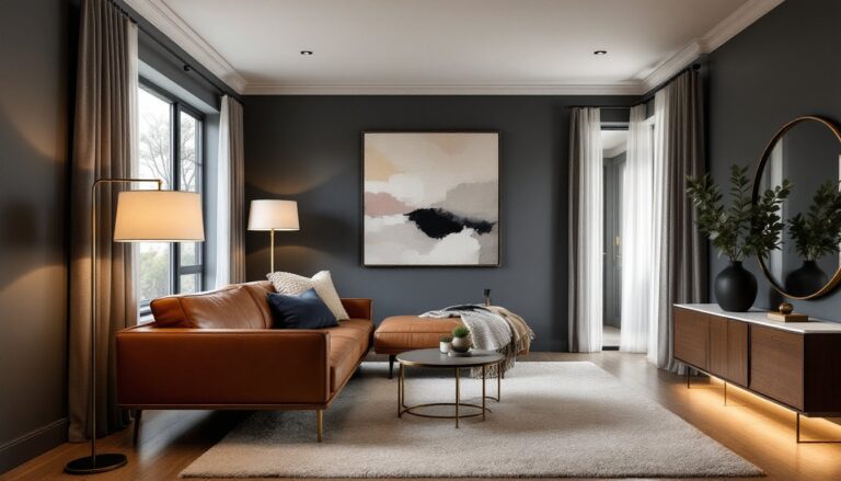
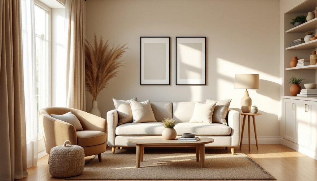
Living rooms benefit from layered beige tones across walls, furniture, and textiles. Start with a mid-tone beige on the walls (consider Behr Wheat Bread or Valspar Woodrow Wilson Putty). Add a cream or oatmeal sofa, then layer in darker taupe throw pillows and a jute rug. Anchor the space with black or dark wood coffee and side tables. Finish with linen curtains and a warm-toned wood media console. The result feels collected, not matched.
Bedrooms thrive with softer, warmer beiges that promote relaxation. Paint walls in a light sand or almond tone, then add an upholstered headboard in a deeper taupe or camel. Use white or cream bedding to keep the bed bright, then add texture with a chunky knit throw or linen duvet. A sisal rug under the bed and natural wood nightstands complete the look. Keep overhead lighting soft, consider dimmable LED bulbs around 2700K for a warm glow.
Kitchens need durability and practicality. Beige cabinetry (especially with a satin or semi-gloss finish) hides fingerprints better than white or dark colors. Pair beige cabinets with white subway tile or a marble-look quartz backsplash. Use brushed gold or matte black hardware for definition. If the cabinets are white, consider beige or greige walls to soften the space. A butcher block countertop or wood open shelving adds warmth.
Bathrooms suit cooler beiges with plenty of white. Paint walls a light greige, use white subway tile, and add beige or taupe grout (it hides soap scum and mildew better than white grout). A wood vanity or open shelving brings in texture. Finish with white towels, a jute bath mat, and matte black faucets. Many interior home design strategies incorporate similar neutral schemes to maintain flow between rooms.
Home offices benefit from the calming effect of beige without feeling too sleepy. Use a mid-tone beige on three walls and a deeper taupe or charcoal on the fourth as an accent. Add wood shelving, a leather or fabric desk chair in tan or brown, and a patterned rug with beige as a base color. This creates a focused environment without the clinical feel of all-white or all-gray spaces. Platforms like HGTV regularly feature home office makeovers that balance neutral palettes with functional design.
Entryways and hallways often get overlooked, but beige here creates continuity. Use the same beige on walls and trim, then add interest with a statement light fixture, a console table in natural wood, and a patterned runner rug. Keep the palette simple so these transition spaces don’t compete with adjoining rooms. For broader home decor approaches that tie multiple rooms together, maintaining a consistent neutral thread helps unify the entire home.
Regardless of room type, always prep surfaces properly before painting. Fill nail holes with lightweight spackle, sand smooth with 120-grit sandpaper, then prime with a tinted primer close to the final color. Beige shows imperfections less than white, but poor prep still telegraphs through. Two coats of quality paint (not the budget stuff) will give better coverage and durability, especially in high-traffic areas. Brands like Sherwin-Williams Duration, Benjamin Moore Aura, or Behr Marquee offer better hide and washability than builder-grade paints.