Table of Contents
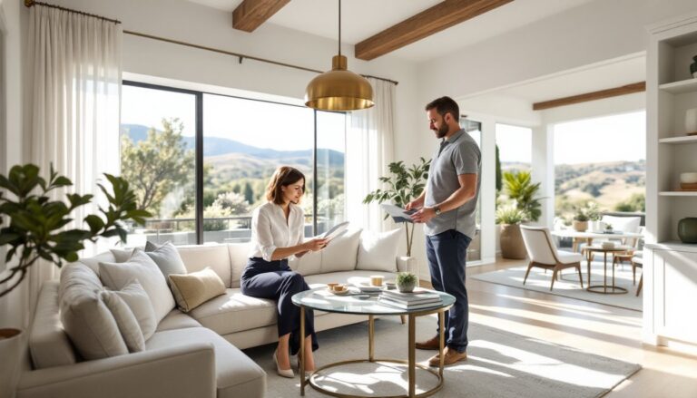
ToggleWalking into a room that feels right isn’t magic, it’s the result of deliberate design choices grounded in a few fundamental principles. Whether renovating a single room or tackling a whole-house refresh, understanding interior design basics gives homeowners the confidence to make decisions that balance function, style, and budget. This guide breaks down the core concepts, from spatial balance to lighting techniques, without the fluff. These aren’t just aesthetic considerations: they’re practical tools that help DIYers avoid costly mistakes and create spaces that actually work for daily life.
Key Takeaways
- Interior design basics—including balance, proportion, scale, and rhythm—provide practical frameworks that help DIYers avoid costly mistakes and create functional, intentional spaces.
- The 60-30-10 color rule (60% dominant, 30% secondary, 10% accent) prevents color overload while maintaining visual interest, and testing paint samples for 48 hours ensures the right choice under different lighting conditions.
- Proper furniture placement should prioritize focal points, maintain conversation distance of 8-10 feet between seating, and ensure clear traffic paths of 30-36 inches wide for functional room layouts.
- Layering three types of lighting—ambient, task, and accent—with appropriate lumens and color temperature (warm white for living spaces, bright white for kitchens) transforms flat-feeling rooms into welcoming environments.
- Mixing textures, patterns, and materials in different scales and related color palettes creates visual depth and prevents rooms from feeling staged or monochromatic.
- Investing in quality materials for high-visibility areas first and reserving trendy colors and patterns for easily changeable accessories ensures designs remain timeless and flexible.
Understanding the Core Principles of Interior Design
Interior design rests on a handful of timeless principles that guide every decision, from wall color to furniture selection. These aren’t theoretical concepts, they’re practical frameworks that prevent rooms from feeling off-balance or chaotic.
Balance, Proportion, and Scale
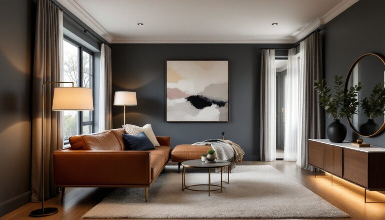
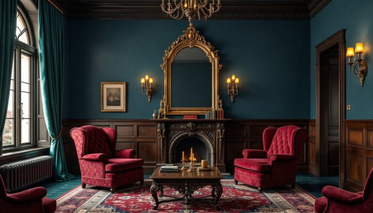
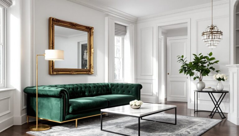
Balance refers to the visual weight distribution in a room. There are three types: symmetrical (formal, mirrored arrangements common in traditional spaces), asymmetrical (informal, using different objects of similar visual weight), and radial (elements radiating from a central point, like chairs around a dining table). Symmetrical balance is easiest for beginners, matching nightstands flanking a bed, identical lamps on either end of a sofa. Asymmetrical balance requires more practice but feels more dynamic.
Proportion describes how objects relate to each other in size. A common mistake: pairing a massive sectional with a tiny coffee table, or hanging undersized art above a king bed. The classic rule for art above furniture is 2/3 the width of the piece below it. For coffee tables, aim for about 2/3 the length of your sofa and leave 14-18 inches of clearance between the table edge and seating.
Scale addresses how furniture fits the room itself. A oversized sectional in a 10×12 bedroom will overwhelm the space, while delicate bistro chairs in a great room with 12-foot ceilings look lost. Measure room dimensions before shopping, and use painter’s tape on the floor to mark furniture footprints. This simple prep work prevents expensive returns.
Rhythm, Harmony, and Contrast
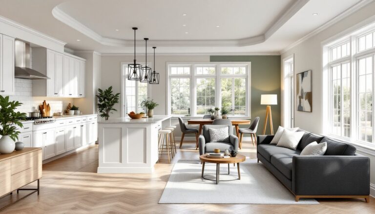
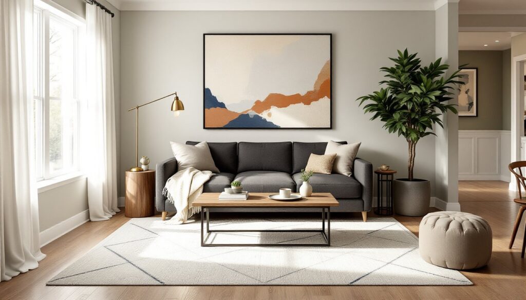
Rhythm creates visual movement through repetition, progression, or transition. Repeating a navy blue accent across throw pillows, artwork, and a rug establishes rhythm. Progression might involve arranging books or candles by height. Transition guides the eye smoothly, like using archways or paint color shifts to delineate spaces in an open floor plan.
Harmony means all elements work together toward a unified feel. If you’re going for a modern farmhouse vibe, that chrome-and-glass coffee table doesn’t belong, no matter how much you like it. Stick to a consistent style direction, though mixing eras (like mid-century modern chairs with industrial lighting) can work when they share common elements like wood tones or metal finishes.
Contrast prevents rooms from reading as flat or boring. Pair light walls with dark trim, smooth leather with nubby linen, or geometric patterns with organic shapes. Without contrast, even expensive furniture can fade into blandness. Just don’t overdo it, too much contrast creates visual chaos rather than interest.
Choosing the Right Color Palette for Your Space
Color is the most powerful, and most reversible, design tool available to DIYers. A gallon of paint costs $30-60 and covers about 350-400 square feet, making it the highest-impact, lowest-cost change possible.
Start with the 60-30-10 rule: 60% dominant color (usually walls), 30% secondary color (upholstery, curtains), and 10% accent color (pillows, art, accessories). This formula prevents color overload while providing enough variety to keep things interesting.
Test paint samples on multiple walls, not just one. Light changes throughout the day, and a color that looks perfect in morning sun might read completely different under evening lamps. Many design professionals recommend living with sample patches for at least 48 hours before committing.
For small rooms, lighter colors genuinely do make spaces feel larger by reflecting more light, but don’t default to builder-grade beige out of fear. Soft grays, pale blues, and warm whites offer the same spacious effect with more personality. Dark colors in small spaces can work, they create a cozy, enveloping feel, but require excellent lighting to avoid feeling cave-like.
Consider existing fixed elements that aren’t changing: flooring, countertops, tile. Your color palette needs to work with these, not fight them. If you’ve got honey oak floors from the ’90s that aren’t getting replaced, cooler paint tones will clash. Work with warm neutrals or embrace the oak and go full vintage.
Undertones matter more than the color family. Greige (gray-beige hybrid) can lean pink, green, or purple depending on its undertones, and the wrong one will never look right no matter how many times you repaint. Compare samples against your flooring and fabrics in natural light to spot undertones before buying five gallons.
Mastering Furniture Placement and Room Layout
Furniture arrangement can make a 12×14 living room feel spacious or cramped. The difference comes down to traffic flow, focal points, and understanding how people actually use the space.
Identify the room’s focal point first, fireplace, picture window, or built-in shelving. Arrange seating to acknowledge it, not fight it. Putting a sofa with its back to a fireplace wastes the room’s best feature. If there’s no natural focal point, create one with a media console, gallery wall, or accent paint.
For conversation areas, place seating no more than 8-10 feet apart. Beyond that distance, people strain to hear each other and the space feels disconnected. Create intimate groupings rather than lining furniture against walls, which works only in very small rooms. Floating a sofa away from the wall by even 12-18 inches makes most rooms feel more intentional and spacious.
Traffic patterns need clear paths at least 30-36 inches wide. Walk the room’s natural routes, from doorway to seating, to the kitchen, to the hallway, and make sure furniture doesn’t create awkward obstacles. In dining rooms, allow 36-42 inches between the table edge and walls or other furniture so chairs can pull out comfortably.
Area rugs define spaces in open floor plans but must be sized correctly. In living rooms, front legs of all furniture should rest on the rug, or all legs should be on it, floating furniture completely off a rug disconnects the grouping. An 8×10 rug is the minimum for most living rooms: 9×12 works better for larger spaces. In dining areas, the rug should extend at least 24 inches beyond the table on all sides to accommodate pulled-out chairs.
Don’t block windows or heating/cooling vents with furniture. Both reduce efficiency and create functional problems. If a room’s layout forces this choice, consider custom furniture arrangements that work with the space’s constraints rather than against them.
Lighting Techniques That Elevate Every Room
Lighting gets treated as an afterthought in most DIY projects, but it’s as fundamental as paint color. Poor lighting makes even well-designed rooms feel flat or unwelcoming.
Every room needs three types of lighting: ambient (general overhead), task (focused light for specific activities), and accent (highlighting architectural features or decor). Relying on a single ceiling fixture creates harsh shadows and leaves corners dark. Layer all three types for flexibility and depth.
Ambient lighting comes from ceiling fixtures, recessed cans, or chandeliers. For general living spaces, aim for about 20 lumens per square foot. A 150-square-foot room needs roughly 3,000 lumens total. LED bulbs list lumens on the package, a 60-watt-equivalent LED produces about 800 lumens. Dimmer switches are worth the $15-25 upgrade: they provide control for different activities and moods.
Task lighting includes under-cabinet lights in kitchens, reading lamps by chairs, and vanity lighting in bathrooms. These should be bright enough for their purpose without glare. For kitchen counters, LED strip lighting or puck lights installed under wall cabinets eliminate shadows when prepping food. In bathrooms, vertical fixtures flanking mirrors provide better facial lighting than a single fixture above.
Accent lighting highlights artwork, architectural details, or plants. Track lighting, picture lights, or even well-placed floor lamps create visual interest after dark. This layer is optional in bedrooms or kids’ rooms but makes significant impact in living rooms and entryways.
Many homeowners underestimate the importance of proper lighting design when planning renovations. Bulb color temperature matters as much as brightness. Warm white (2700-3000K) suits living rooms, bedrooms, and dining areas. Bright white (3500-4100K) works for kitchens, bathrooms, and task areas. Daylight (5000-6500K) mimics noon sun and suits workshops or detailed craft areas but feels too harsh for living spaces.
When installing new fixtures, ceiling boxes must be rated for the fixture’s weight, most standard boxes handle 50 pounds, but heavy chandeliers require fan-rated boxes that support up to 150 pounds. If adding recessed cans, IC-rated (insulation contact) housings are required wherever insulation is present. This isn’t cosmetic, it’s fire safety. Consult NEC (National Electrical Code) requirements or hire a licensed electrician for any work beyond swapping fixtures on existing boxes.
Selecting Textures, Patterns, and Materials
Visual interest in a room comes from mixing textures, patterns, and materials, not just piling on more stuff. A monochromatic room in all smooth, shiny surfaces feels sterile. The same palette with varied textures reads as sophisticated.
Texture refers to how surfaces feel and appear: smooth leather versus chunky knit throws, glossy tile versus matte paint, rough jute rugs versus plush velvet pillows. Aim for at least three different textures in any room. Hard surfaces (wood, metal, glass) balance soft ones (fabric, rugs, upholstery). In modern or minimalist spaces where color is limited, texture becomes even more critical for preventing blandness.
When working with limited square footage, understanding spatial design fundamentals helps create visual depth through material choices. Pattern mixing intimidates many DIYers, but it follows simple guidelines. Combine patterns of different scales: a large floral with a small geometric, or a wide stripe with a tiny dot. Keep them in a related color palette, if your large-scale pattern has navy and coral, your smaller patterns should pull from those same colors. Limit yourself to three patterns in one space, and balance them with solid fabrics to give the eye rest.
Avoid matching sets that come pre-coordinated. Those look staged, not lived-in. Mix and match pillows, vary artwork frames, combine wood finishes. A room with all oak furniture and matching oak trim reads as flat: introducing walnut or painted pieces adds depth.
Material selection impacts durability and maintenance as much as aesthetics. In high-traffic areas, choose performance fabrics with at least 30,000 double rubs (Wyzenbeek abrasion test rating). Leather, microfiber, and outdoor fabrics work well for families with kids or pets. Save delicate linens and silks for low-use spaces like guest rooms.
For DIY upholstery or reupholstering projects, natural fibers (cotton, linen, wool) are easier to work with than synthetics, they’re more forgiving when stapling and don’t fray as aggressively when cut. That said, polyester blends resist staining better and cost less, making them practical for dining chairs that see daily use.
Real wood, stone, and metal age gracefully and develop patina. Laminate and vinyl imitations eventually look dated and worn. If budget constraints mean choosing between real materials in smaller quantities or imitations everywhere, go real and work in phases. Solid hardwood in the main living area beats laminate throughout the house, even if it means delaying the bedroom floors a year. Projects focused on implementing cohesive design elements benefit from investing in quality materials for high-visibility areas first.
When incorporating trends covered in publications like House Beautiful, remember that neutral foundational materials allow flexibility. Tile and flooring choices should be timeless: bring in trend colors and patterns through easily changed elements like pillows, throws, and accessories. Subway tile and hardwood floors won’t feel dated in five years. Trendy geometric tile in a bold color might.